Pages

Friday, August 31, 2012

Exponential Rocket Launcher Gear Review!

Hey guys, BillCheesey5's back, and still wondering why he's talking in third person.

Anyways, it's been ages since I wrote a review, and it's been ages since I made a gear review at that. Let's go!

Exponential Rocket Launcher

Mesh: The mesh of the gear has not been used before (not surprising, there's not many gear retextures these days), and it looks really nice. It's nicely shaped and meshed. It has the end (or top, or tip) of a rocket (or the ammo) sticking out at the end and it proves rockets are actually going to shoot out and not muffin cats.

Or Nyan Cats for that matter.

Anyways, this mesh is nicely shaped, and it recieves an overall 10/10. It even has a trigger!

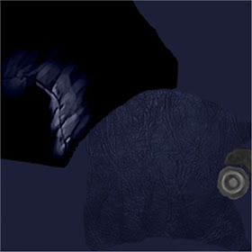
Texture: This launcher has yellow racing stripes (even though it's not a car... I hope) and the tip of what we can see of the rocket has a dark green colour. There's what appears to be a button on it which is red, so again, more colours. The rest is just really a grey-ish colour, but that's good.

Because if we had a rainbowtastic and happy rocket launcher covered with smilies in our hands, no one would take you seriously.

Overall, the texture gets a 9/10. I honestly expected to see a bit more blue.

Public Enjoyment: Again, (like usual), I'm heading to Twitter to see what people think of this gear.

@DGProStudio: "Futurist..ic?"

 @Phantomazing: "I haven't used it yet, but I like the mesh and texture, and it sounds pretty powerful."

@Nate_Wenger: "It's quite detailed with the texture, the mesh looks pretty rad, and it sounds like it is a 1 hit kill just by the name."

(If I ever use your tweet here, tell me your favourite colour and I'll use it on the username in the article!)

So it appears it is quite enjoyed by the public, nothing bad, as far as I can see.SO it gets an overall 10/10 on Public Enjoyment.

Overall: Overall, the gear receives a 9.5/10. A perfect mesh and enjoyed by the public, and a good texture. Link to the gear: http://www.roblox.com/Exponential-Rocket-Launcher-item?id=90718505

 My TWITTER: @BillCheesey5

That's the Twitter you should follow if you want to keep updated with ROBLOX, RN and when I'm making a post!

Thanks for reading!
read more ››

Gifts of Paralympia!

With the Paralympics Opening Ceremony on Wednesday and the first day of games completed yesterday, I thought it would be fitting to release a few gifts to commemorate these events. Over the next few days I will be releasing a few highly collectible Paralympic themed gifts. They will be on sale for a limited time so you'll have to be quick to spot them and take a copy for yourself!


Only one gift will be sale at a time and will be set alight to mark that it is able to taken. These gifts will only be on sale for 1 day or less, so you must be quick!


Here is the list of gifts:

Paralympic Gift of Opening Ceremony

Paralympic Gift of Opening Ceremony
This gift went on sale on the day of the Paralympics Opening Ceremony (Wednesday 29th of August), it will only be on sale for a few more hours so take one now!


Mandeville Gift of Paralympic Mascot
This gift will be available on Sunday 2nd of September


Bronze Gift of Paralympia

Bronze Gift of Paralympia
This gift will be available on Tuesday 4th of September


????


This gift will be available on Tuesday 4th of September


????


This gift will be available on Thursday 6th of September


????


This final gift will be available at some point on Sunday 9th of September - Paralympic Closing Ceremony


Thanks!

-Arbirator
Editor of Roblox News

read more ››

Saturday, August 25, 2012

RAMP 1000000 RANT Review

Lookit how cool that is. It's like, a car and no one is driving and it's standing still and it's really stupid and... need I go on?
Alright, before I start this RANT off I'd like to make fun of the name. It says RAMP 1000000. 1000000 what? Feet? Meters? Miles? Lightyears? Inches? The title doesn't even make sense! It just says RAMP 1000000. If you're going to make a game make sure the title makes sense. Name it something like, "Ride down a 100000 mile ramp" or something. I mean seriously! Are you really that lazy? Anyway, on to the review.
Gameplay 0/10
OMGCRACK
Getting stuck because of a crack.
If you enjoy lagging down small ramps then this game is for you. The basic goal of this game is to ride down an obviously free modeled ramp in obviously free modeled cars to a large baseplate with random items that server no purpose. Oh, and those items are also free models. Surprise! Anyway, there isn't even a winner's spawn at the end so every time you die you have to go through the whole thing again. There is no enjoyment at all
Effort 0/10
There was no effort. He basically looked in the free models and clicked the things that looked cool. He didn't even space them properly. Also, the place is plagued by constant messages popping up saying "Regen" and stuff like that which gets really annoying after awhile.
Creavity 0/10
There is nothing new about this. It's just another ramp game, or should I say RAMP.
Overall 0/10
Suggestions
  • Take your computer, cover it with barbecue sauce, go outside, put your computer on a grill or in a fireplace or something like that, douse it with lighter fluid, light a match, and burn it.
  • Don't get a new computer after completing the above step.
Tips
  • Don't play this game, unless of course you want to laugh at it.
 If you want your place reviewed simply contact Banjobug on twitter or send me a private message on ROBLOX. The next post could be about your place! I'll be glad to give you ideas on your place and help make it better. Also, if you find a place that is absolutely awful and on the front page send me a PM and I might make a RANT about it!

Also, you should follow me on twitter even if you don't have a RANT or review request! Sometimes I invite my followers to go to places with me to help review them.

Place Reviewed: RAMP 1000000

Reviewed by: Banjobug
read more ››

Friday, August 24, 2012

Hat Review: MUSCLEHEAD!!!

I hope you like rare items because this item is an extremely rare item that went OFFSALE!!! Although it doesn't look very appealing, I have to admit, I wish I had it :P. But without further ado, I am about to present to you, an item introduced in 2010, MUSCLEHEAD!!!


Mesh: 10/10

The mesh on this hat is very, very unique. This may be the ONLY hat that I KNOW OF that is a two part hat. If you don't know what I mean by that, I mean that it appears that the two pieces of it are separated. Although it isn't, it seems like it. This is the only mesh I've seen like this but I'd really like to see more hats like this.

Texture: 10/10

This texture is also very unique. I would really like to see someone make a retexture of this. Check that. I'd like to see someone make a GOOD retexture of this. No recoloring or any of that crap. It looks really realistic. Overall I really liked this texture. I had one problem though. It kinda looks like the outside is green, but maybe that's cause I'm a little colorblind. It still gets the full 10/10.

Outfits: 10/10


This hat doesn't really go well with other hats, but you really don't need other hats. If you look at it, it pretty much encloses your entire head. The only problem I have with it is that it shows that your head is bald. But that's an easy fix. Just add some hair! I really like the way it fits AROUND your head, instead of a lot of the hats that ROBLOX makes. The usual hats usually go on top of your head and that gets boring but this hat encloses your entire head.

Value: 11/10

I can't find the original value of this item but I have heard from all over LMaD that they would pay around 50k for it. It is very rare with just 300+ in stock. I did hear though (thanks to Vilicus) that the original price was pretty low. And some people that own this item are probably deleted or inactive since it was made in 2010. This hat is very rare and it will probably sell for very, very high. This definitely deserves an 11 in value.

User Feedback:

FantaYum1: I wish I had. WHO HAS IT?!

camey25: Epic. Buying if it goes limited

@IBarrageIFairly ugly but funny hat. Forgotten for a reason.


RandomCowGoesMooo: Hottest hat yet

Suggestions:

1. Make rainbows

2. Add unicorns

3. Add Shedletsky

4. Instant epic retexture.

5. Haha but in all honestly, this hat (IMO) is honestly flawless. I saw a lot of comments on a thread I made saything it was ugly and no one would ever buy it but in my opinion, it is the only one of its kind and it is absolutely flawless. Great job ROBLOX!

Well that wraps up another Hat Review. 


read more ››

Gear Review: Deluxe Hook Shot!


Dark here, today I’m going to do a little review on our newest grappling hook, Deluxe Hook Shot.  Why is this review taking me so long? Well, I’ve been trying to cover all of the new gear (Deluxe Hook Shot, Adventure Island, Tiger Skin and Dart Trap) but In catalog heaven the only 2 gear that worked were Deluxe Hook Shot and Adventure Island so I decided I would just make a separate review on Deluxe Hook Shot.


 Abilities/Effects: 9/10

       This gears abilities are the same as every other grappling hook, you click on any stable brick, and it could be across the map it would still bring you to it.  If you see someone up on a mountain you can click on them, the grappling hook either brings them towards you and throws them on the ground or it pull you towards the, and lets you let normally on the ground next to them.  You could use the pulling them towards you by clicking on them then soon as they get near you switch to a sword and kill them or you could click on them and it would bring you towards them and soon as you get near them you quickly change to a sword and kill them.

Appearance: 7/10

I personally think this gear has too much of a cartoonish appearance, it seems to fake and animated for a grappling hook, it seems to fake for what it can do if you know what I mean… Maybe if it was darker like a black with a bit of rust it would seem a lot more realistic?  It looks nice in the avatars hands, as if it was a gun!


Pricing: 6/10

This grappling hook cost 750 robux, 45 robux more than the original grappling hook I personally think the MAX price for this gear should be 500 robux, if you tested the gear on catalog heaven, you would not think it would be worth 750 robux, you would think of it more as a 300-500 robux gear.  In conclusion I think this gear is overpriced by a nice bit.


Overall: 7.5/10

I think this gear has some nice abilities; it looks good enough I suppose for “Adventure based” gear and the price is reasonable.  When I first tested the gear I really enjoyed it.  So overall I give this a 7.5/10.

Thanks for reading!

Like what I write? Follow me on twitter @darkfish900

read more ››

Thursday, August 23, 2012

Why do users visit certain games?


This is a nice lengthy post I am going to write for you readers tonight! There was two versions of this post, one has mysteriously disappeared from our dashboard, and two is this one! :P Today I am telling you about how games are popular and why.

Now, we know loads of great game developers like Crazyman32, Wingman8, and TheGamer101.
These three game creators all spend a lot of time developing and perfecting their games. But what makes their games so appealing? There is so many things on ROBLOX that makes a game appealing, and with some of them- provided by ROBLOX and designed and visualized by us.

Roblox users are critics, some may not know it, but all of us users are critics some how. We all judge games, we all play games. Game that are on the front page, were decided by users. Games that are on the front page of ROBLOX are always good games, some may not be original- for example "JaredValdez4", but the games Jared Valdez has, are great games. So therefore it is on the front page. Users don't really care about who's game it is, as long as it's a good game- like JaredValdez' games, it's a front-page material game.

All users must know that some games that are very good, can't always get noticed when they are up against Crazyman32's freeflight and Sword Fighting Tournament by TheGamer101.

I asked many users on ROBLOX which Genre of game they thought were the best, around 50% said "Military/War", and around 10% said "Adventure" the rest said "RPG". All three of this Genres are very appealing to many, many users. Personally, I like Adventure and Mystery. But that's my choice.

On to building, building on ROBLOX is actually not the top on my list of appealing objects of a game, but building is in the top 3. Building doesn't have to be CFramed, although CFraming helps the building go way-beyond what you expect. But there is one aspect of building that can actually replace CFraming, which surprisingly is Terrain, people are loving the Terrain. There is a few games on ROBLOX that show what you can do with terrain, like "Freeflight" by Crazyman32, Terrain can make people love the game, but it has to be made to perfection.

Another thing on my list was the front-cover of a game. Games like "Welcome To Roblox Building" have nice, nice pictures. Here is an example I whipped up:
This was easily made with Photoshop and can be made with other image editing software. The best three I would say on the internet are Paint.NET, Gimp, and Photoshop. They can all be found if you write their names in the google search. If you look at the example image, in a way it appeals to you. You like the way it is made, and CFramed, and the special effects on the image, make people love games. Like Crazyman32's Freeflight (I know I've mentioned it a lot) it has a great image, that was made fairly simple using ROBLOX tools and Photoshop text with Lens Flares. So, graphic design is one of the main things, it's probably fourth in my list.

Scripting, now scripting is probably second in everybody's list. It makes a game be a game. Without any scripting, your game is nothing. Even if it's only allowing gear, it's scripting and that's the bottom line. Games like "Mountain Brawl Gear Fight" by our very own IBarrageI, has few scripting like Swords, but that game does not need scripting, as it has allowed gear. That's scripting, even if the gear that you have bought isn't made by the creator, it's scripting. Especially if you allow ROBLOX gear, it is made by the masters, and will be good.

Now I was so confused about my results on this, according to my research, users are more appealed to a game, by the materials and the way they are put. I found this an astonishing result! Materials in a game, if they are put in the game well, they are a very attractive and alluring element. People love them. Games like "The Underground Base" by SuperAlpacaMan have many choices of materials that change the way users think of the game. I found, the most loved material was actually "Slate" followed by "Grass". But this can change on what computer you are using, if you are using a state of the art Graphics Card, like me. You see everything in a great, view. I have textures on top all the time, and they view amazing. Some textures like Foil aren't as nice on Low texture settings, this is something that makes things have to be chosen wisely. So be careful with your choices!

The conclusion I came to is that ROBLOX Materials are judged more then anything else on ROBLOX games.

Thanks for reading this nice, lengthy post by MEE!!!! :D

Care to tweet for us?


Also, want any updates on my newest posts, or projects?


read more ››

Shady Business Hat Critique


Shady Business Hat

Hmmm. Well isn't this something? From a glance, it's just like any other fedora. Same sort of style. But people don't look further into it. It's style resembles a type of hat that is highly looked at as a famous hat. Yes, I am talking about the classic fedora and the Sparkle Time Fedoras. The actual design and the name of it suggests that this is worn by "Shady Businessmen" AKA The Mafia (And they sure have done well  in capturing that theme). It is also very realistic, and can appeal to many players, not just because it's a fedora, but that it's a good alternative to lashing out 1000's of R$ on a classic fedora (Not saying that they will not want the classic though).

As I said earlier on, it looks as if this was meant to represent 2 other hats. and this is the picture showing us the comparison:


First off. There is a likeness to the other hats, though not exact. First of all, it's the same sort of style, it's slightly flat, just like the classics. Though if there is one thing that doesn't match it, it the size. It's been made fairly smaller.

The positioning is also very similar to the classics. As seen on this character.
IBarrageI
It's almost as if it was to almost represent the classics.
Just like below. But there are obvious differences.
shadow888888880
The brim on the classic is lower and wider. but that's pretty much the only obvious differences. (Thanks to shadow888888880 for the character)

This hat is priced at 1000 R$. A very decent price considering what is looks like. It's a price worth paying for it. (And I should know, I bought it myself). But don't take my word for it.

Comments from ROBLOX:

Posted 1 hour ago by jumbochris1995
Oh man, I want this.

Posted 1 hour ago by tomcis147
holy cow

Posted 2 hours ago by rikublade4817
At least its a decent hat we hadnt seen a decent hat in a while

LordL3git: I really want it but I spent all of mah moneh because im so dumb I have a feeling once it is limited it will go big.


IBLackoutzz: I love it. I bought it.

Though, many people are opposed to this fedora, due to the fact it's said to be designed for the 3.0 bodies. But frankly in my opinion, it suits 1.0, 2.0 AND 3.0 So I don't know what they are complaining about..

The hat is also timed and goes offsale in 2 days, and it already has over 900 sales. (A popular hat indeed)

tl;dr A good hat that looks like a classic, worth buying.

Thank you for reading, Also, suggest other hats I could critique.
read more ››

Roblox Studio 2.0: A step in the right direction?

Now, as we may know. Roblox studio 2.0 is in progression and currently being made by the ROBLOX admins. Roblox studio 2.0 is actually better than some users expect it to be. Personally, I like ROBLOX Studio 2.0, but the loss of some building tools has annoyed me. I don't use the default move and resize tools. I use the old ones from years ago (I find them more reliable). But a lot of new people like the newest building tools. Studio 2.0 is a very nice update, they have made the interface designs better, made it easier to control, and less confusing. I can't wait until this is out of BETA and ready to be used.

I would like Studio or Studio 2.0 to be an option so you don't have to use 2.0 if you don't want to. I took a look at 2.0 and I found it very nice. I do like it lots, but I still prefer studio 1.0. They have now in Studio 2.0 made math.() be highlighted in blue when writing scripts, so I like that lots. Although I would prefer it if they added auto-tabbing so that you don't have to keep tapping the tab button to organize your scripts.

Overall, studio 2.0 is a great addition, for all those Newbies and Old Robloxians. It's fun to build with, but still has some flaws I hate so much. I loved old tools that moved/resized things. But now we have to use those new ones in it, I would use 1.0 more.

Thanks for reading this short post.

Want updates on my newest things?

read more ››

Wednesday, August 22, 2012

BaseSkull Cap Hat Review!


Hey, Dark here in my last review which came out a few days ago about nooooooo retexture :  Hood of the Lonely Raven Hat I was talking about how nice some hats fit and look very cool on the ROBLOX avatar… BaseSkull Cap isn’t one of those hats…

Mesh:

The first thing I want to say is that this hat diffidently has its own creative mesh, It’s not like another all baseball cap to ever be released on ROBLOX.  If the word “Cap” was not in the name of this hat you honestly wouldn’t know if this was a baseball cap or not… The forehead over the eyes of the skull comes way over the ROBLOXians head; it just pops out of the top of the ROBLOXians head, then the lower set of teeth come out over the ROBLOXians eyes to sort of create the image of the front part of a baseball cap.  Overall I give the mesh and 5/10 because you can hardly tell it actually is a cap.


Texture:

This texture… this texture is very… odd.  It’s very complicated and must be extremely difficult to retexture.  All you can pick out from the texture is a few teeth on the bottom part of the image, to the right you can tell it is part of the forehead and back of the head and you can see the resemblance in a skull on the left side.  Overall I give the texture a 10/10 for extreme detail and difficulty into the making of this texture.

Profit:

This Cap made a nice bit of profit, nobody actually expected much profit, it was originally 100 robux with 2000 in stock.  The day it came out at one point the price hit about 500 Robux, I resold mine for 400 robux and made 198 robux profit, it didn’t make a huge amount of profit but it made more than intended.  Overall I give this hat an 8/10 because nobody expects profit from a hat with 2000 in stock.

User feedback:

@NonstopepicRBLX: I find it very ugly but great for small profit.

@RBX_Zakary99: I am personally an investor, and i was surprised that people are earning profit from it. I bought it and commented "no profit."

@PurPrin121: It's very kewl but not something I would buy.


Overall I give this hat a 7/10 I thought the texture was great and the profit was great but the mesh wasn’t so good.  I personally don’t think this a half bad hat!

Thanks for reading I hope you enjoyed my review!

Like what I write? Follow me on twitter @darkfish900
read more ››

Tuesday, August 21, 2012

Limited Drought?

So as a LMaDer I live off of limiteds. Why you may ask? Because I WANT PROFITZZZ. Haha just kidding. LMaD, as a forum, relies on new limiteds, well profitable ones at that. Without new limiteds, LMaD wouldn't thrive. And recently, we haven't had any "Big Win" limiteds. The most recent limited was the "The Darkest Archmage" which really didn't make a "Huge Profit" (huge profits are hats that make up to 5k profits). I can literally go back 3 FULL PAGES of the new catalog (the new catalog fits more hats in than the older one, I could've gone about 6-7 pages before) until I reach a "Big Win". That "Big Win" would be the Rainbow Fedora. Now some big questions people would ask would be, "Why isn't the "Lord of Federation" a "Big Win"? Well, that's simple. There was only 10 in stock so that would mean only 10 people would've made a "Huge Profit" (why do I keep on using quotes around these? I don't know). The Rainbow Fedora had 500 sold which would make it a "Big Win". Now let me get back to my point.

We've had at least 3 weeks without a Big Win. This has made LMaD crazy. And wanna know what's worse? Rumors. Rumor has it, that there will be a new Sparkle Time Fedora. The Green Sparkle Time Fedora. There are many rumors around that say that it'll come out anytime now. BUT I have a reason not to believe this. There has been a pattern with the STFs. The Sparkle Time Fedora (original) came out during Christmas in 2007. The PSTF (Purple Sparkle Time Fedora) came out during Halloween 2011. The RSTF (Red Sparkle Time Fedora) came out during Valentines 2012. See the pattern? Each came out during a holiday. Likewise, the GSTF will probably come out St. Patrick's day in 2013. Hopefully though, there will be a BSTF (Blue Sparkle Time Fedora) in the winter, but I don't want to start rumors.

Another rumor is the White Fedora. ROBLOX already made the texture so we can imply that it MAY come out sometime soon. If it does come out I can tell it will make a huge profit. Any fedora will make a huge profit. Nuff said.

The last and final rumor is the Periastrons. Rumor has it that BrightEyes said at RGC, there will be 7 Periastrons. Only 3 have been released. She also said the next one come out very soon. The only problem is she said this during the RGC. Which was one month ago and there still hasn't been a new Periastron. LordNavy, a 2 year LMaDer, has found the mesh and the texture of the new gear in the backlog which means it will come out sometime. The only thing that REALLY concerns me is that the Periastrons had a pattern going on. There was one released every two months. But it's been past two months and the next one still hasn't been released. Maybe ROBLOX is saving limiteds for Black Friday. Or maybe ROBLOX wants to ruin the pattern so that we can't predict when the next one will come out. Who knows? Only ROBLOX.

But besides those rumors, the limiteds are becoming like a drought for LMaD.


This has been a Catalog Review by alexkylerock.
Follow me on twitter @alexkylerock!
read more ››

Monday, August 20, 2012

Destroy The 51 Characters! Moan-Up Place Review


Destroy The 47 Characters!_Image

You will not believe, what I have been through for you readers tonight! I feel used. I only wanted to review a game.. But this cannot possibly be a game. This "thing" is a "thing" of destruction, and... lag. This is, Destroy The 51 Characters! Get ready because I'm about to let out a rage puddle of LAVA!

The game actually has many images, I decided that this one was the best by far. Now, the game doesn't look all that bad when you first look at the front cover, but then.. you have to do it don't you. You clicked play!! I've entered the game, there's a introduction gui that says "Welcome"... and then it says this. I see the text "Do you want to play this game?" I'm like "OMGAWSH I CAN LEAVE???!! :D" Turns out, I have no choice. Oh what kind of fake gui is that. Do you want to play the game, no I entered the game just to leave it, stupid gui. Oh great I had to click it didn't I, I clicked "yes"...

When you press "yes" you enter obviously, the game. But it turns out, that stupid gui was only covering your screen. You actually were in the game the whole time... Pointless. The game is awful anyway, you spawn in a land that gets spammed by text from regenerating models, I have no doubt that these regen scripts are free models. As the message pops up and says "Regening". Personally, I really don't need to know that. People can just stand on the regen and they'll spam the game with messages that, you know what? Aren't necessary!!! I mean, look at this mess of a "game".

The Admin/VIP room, is either free modeled or the worst room I've ever seen. No scenery, just a regen button and free tools. You also get a person to destroy every round, but you know what. Apparently I "Survived the round".. What is this, survive the disasters? On my watch, I don't think destroying monsters is surviving. It is merely playing what the game title says. When you go to the shop, yet again... It's a free model! Awful, awful shop. Who would free model a shop, have party wagons all over the game, have stupid admin and VIP at ridiculous prices for a stupid game, and have a SURVIVE THE DISASTERS SCRIPT IN A DESTROY GAME! Surely, you would make things yourself in order to maximize gameplay. I can't believe people even want to go to a place like this, this is worse than Epic Mining 2!!!!

Yet again, my Moan-Up reviews would go on for ages!! So I'm stopping here...

Scripting: 3/10
The scripting was awful, not even made by the so called "Creator"...

Tools: 10/10
Since these tools are professional and made by the gods- ROBLOX, the tools are epic.

Development: Oh yeah because this game was developed...
This game was probably whipped up with 4 clicks of a button and maybe 5 keys.

Problems: 0/10
Awful game, so many problems! ESPECIALLY THE REGEN!

Difficulty: Super easy
Not impossible, just stand in the corner - YOU GET FREE POINTZ! :D

Front Cover Photo(s): Fine
Not great, not original, but fine.

Building: 0/10
WELL DONE! Good effort!

Fun Filling: Maybe...
If you're one of those people who don't care about development and love letting your anger out on ROBLOX, then great place.
However, if you hate non-developed games and get really annoyed by them, it's not fun.

Thought: 0/10
Well done! Don't be nasty to the creator, he had to think of clicking a few buttons to get those free models inside the game.

Overall: 3/10
I feel violated...

Suggestions:

  • Remove the game from ROBLOX.
Created by Quaz100.
At the time of the moan Destroy the [rest] had 642,904 place visits, and 16,530 favorites...

Want updates on my newest projects/posts? 
Follow me on twitter! @RBX_Zakary99
read more ››

Sunday, August 19, 2012

Rapid Fire Reviews #1

This is a new series of reviews that I, yomamadude6, will be starting. The purpose of these articles is to take a first impression look at a game that is either unpopular, or in beta/alpha testing stages. There will be many of these in a single post and they will all be pretty short. So let's get started with the first edition of Rapid Fire Reviews!


Authority, by SpookyFox

Stage of testing: OPEN BETA
Genre: FPS
Version reviewed: v0.10
Link: http://bit.ly/NLigq2


After seeing that SpookyFox's most successful game, Airport Tycoon, has received a huge amount of visits yet still sucks, I approached this game with caution. After entering in the game, I quickly found that he did not screw this one up. The game contained beautiful GUI, detailed weapons, and beautiful scripting. A "create custom classes" feature as well as perks seem to be on the horizon as well, but for now, you spawn with a random class (possibly for testing purposes). The fast paced gameplay and great visuals make this game a must see for everyone. 

9/10


Choices, by GollyGreg

Stage of testing: Released
Genre: Platformer/Obby
Version reviewed: N/A
Link: http://bit.ly/PsrBEX

I HAD to try out this game after the game description boasted the game would be a "challenge." The game seems like a simple 2 dimensional platformer game at the beginning, however, it actually contains a 3D section as well. After finishing the initial obstacles, the play progresses to a cave where he must use his pathfinding skills to navigate to the exit (which is usually hidden). The camera transition between the two sections are extremely smooth and really well scripted. There are also some interesting story telling elements. However, the cave section is really annoying and many building glitches exist there. Otherwise, this game is quite a good, long, and hard hybrid 2D/3D obstacle you can try to tackle. 

8/10


Wingz World V(5), by NearmissTFW

Stage of testing: OPEN BETA
Genre: Flight Simulator
Version Reviewed: Last update August 17, 2012
Link: http://bit.ly/NvYkv7

The sequel to the super successful Wingz World III(3) and the not-so-well received Wingz World IV(4) is currently in open Beta. The game plays almost identically to Wingz World IV(4) with the mini planes and shrunken world, instead of using Wingz World III(3)'s more popular regular sized planes. The game objectives, however, does improve from the previous version by a lot. There is now an economy system whereby you earn cash from missions in order to spend them in dealerships to purchase planes of your choice. A trading system and rare planes system have also been added to improve upon this concept. The big downside to this game, however, it the fact that the missions so far are INCREDIBLY AND MINDBOGGLINGLY BORING. They simply consist of your having to fly from one airport to another with no twists or turns. The game is still is must try if you've been a fan of the previous installments even if the missions are boring right now.

7/10


That raps it up for the first Rapid Fire Reviews! I'll do more if I find more interesting places to review. Until next time!

read more ››

Saturday, August 18, 2012

Unit 3021 Hat Review!


Today we have a hat review of the Unit 3021 hat.
Unit 3021


Mesh: ANOTHER CARDBOARD ROBOT :D! The mesh is a cardboard box with pieces of... Stuff on it. Hey, is that a "Impossible to Obtain Red Wedding Cake" on the side there? I believe it is (If you don't know what that is, don't worry)! It looks somewhat like a robot (Cardboard box aside), which is good, considering it's a robot. the mesh is nice, and cardboardy. Also innovative. 10/10.

Texture: The texture is shaded nicely, which is a perk because it raises how realistic it is, which is great. The robot pieces are red, which most robots generically are in cartoons, etc. The visor bit is an amazing yellow, which stands out and looks really cool. Overall, it's nice, shaded, shiny and realistic. Needs more blue in my opinion. 8/10.

Value for Money: the hat is just 100 R$, which isn't bad for a realistic, shaded, nicely meshed hat. It's counterpart; "Mr. Robot" (which was made in 2009) is just 30 R$, which has a 70 R$ price gap to the Unit 3021 hat. However, Unit 3021 is more realistic, but it is still a cardboard robot. Nonetheless, it's a great price. Should be a biiiit cheaper, maybe 90 R$? I don't know. 9/10 (Good Value for Money)

Public Enjoyment: Again, going to the streets of social network Twitter, you know the drill.

@Gruntyshka (ROBLOX: GruntyThe1AndOnly):  I don't really like it. ;o

@DGProStudio (ROBLOX: DGProStudio): Futuristic cardboard robot with cyclop's glasses.

Our very own blog owner @arbirator (ROBLOX: arbirator): Mr. Roboto 2.0 - Looks awesome.

Thanks for the replies guys! The public enjoyment seems to be 2 in 3, therefore it gets 6.6666666 (repeating) /10.

Overall: Overall, this hat recieves a 8.7/10. A great mesh with a good texture which most of the public enjoy and a good price. Very great hat. 8.7/10.

FOLLOW ME ON TWITTER: @BillCheesey5!

Link to hat: http://www.roblox.com/Unit-3021-item?id=89609598

Thanks for reading :D 
read more ››

Friday, August 17, 2012

What if ROBLOX had a Stock Market?

So on my trip to Manhattan, I visited the very populated, but amazing, Times Square. And in Times Square, is none other than Nasdaq itself. Well, I took a tour of Nasdaq and while I was in there I was thinking to myself, "What if ROBLOX had its own Stock Market?" (Yes, I think of ROBLOX on vacation too). I was thinking about it and I came up with my own ways of how ROBLOX's stock market would work (my version).

Table of Contents:

1. How it would work
2. How to create one
3. Shares
4. Win/Fail Day
5. How this will affect the ROBLOX econ.
6.TL;DR Version


1. How it would work

Imagine Trade Currency (I will be referring to this as TC throughout this article). Now imagine ROBLOX's groups system. Now combine those. That's how I was thinking this would work. It would be like the TC, but it would be user-owned. A user could create their own Stock Market (I'll go into more details about this in the "How to create one" section) and investors would put their money into it, and depending on the day (I'll also go into more detail in the "Win/Fail Day" section) you would lose money or gain money. The owner of the Stock and people working at the Stock would earn shares of what people invest.

2. How to create one

It would be just as easy as creating a group. Groups>Create New>[Fill in Information]>Emblem>R$>Purchase. But a stock being 100R$, it would have to be more expensive (to make it so that there aren't as many stocks in ROBLOX (i.e. 1000R$). Now, the BIG difference in a Stock is that you can't just join a stock. You can't apply for one either. You have to be hired by the creator. This way, the owner of the stock won't be bombarded with applications of people trying to get into good stocks.

3. Shares

This would be more of ROBLOX's choice. I can't really decide what the shares would be but obviously the higher rank you are in the stock, the more money you would earn. And obviously there would be a capacity limit for each stock (i.e. 50 ROBLOXians per stock). But this is just my example. Depending on the day (again, I will get into more detail of this in the "Win/Fail Day" section), each person in the stock would also earn or lose money. Obviously the investor would gain more of the share because he is the one investing. This is my list of shares:
Investor: 55%
Owner: 25%
Admin: 12.5%
Worker: 5%
(Lower Rank): 2.5%

4. Win/Fail Day

Each day would act as a win/fail day. Only ROBLOX could determine whether it is a win/fail day. If it was a win day, that would mean ROBLOX released a good item and it either sold quickly or made a huge profit. It would also be a win day if the many limiteds' graph rose. A fail day would work like this: 1) ROBLOX released a item that sold very slowly, or with no profit. 2) Many limiteds' graph fell dramatically. 3) An item was projected (this is when someone buys many copies of items and deletes them making the amount of them in existence lower but making the price higher, DON'T BUY THESE). There are also days that wouldn't fail or win. For example, if ROBLOX released an item like the Lord of the Federation, that hat sold quickly and made a profit, but many people won't buy it.

5. How this will affect the ROBLOX econ.

I thought that this would be a great addition to ROBLOX (if it was added) because it would stimulated the econ and it would also stimulate the inflation rate so that it wouldn't really raise or lower. Nuff said.

6. TL;DR version

Someone makes a stock. You invest money. Depending on the day, you gain or lose money. The owner and workers of the stock earn shares of your money. Details above.

This has been a site suggestion by alexkylerock.
Wanna hear more about my posts? Follow me @alexkylerock.
read more ››

Thursday, August 16, 2012

Hood of the Lonely Raven Hat Review


So, what’s up guys? Dark here with another great hat review, in my last hat review on Rainbow fedora, I explained at the end that I would be going on vacation, well now I’m back. I will be doing a couple reviews now to catch up.  Anyways in this post I will review a retexture made by nooooooo which brighteyes took for Hatsplosion 2 which was basically just a group of awesome retextured hats that brighteyes published.  Ok now finally, let’s get on with the review:

Mesh:

Well, the mesh contains a really cool hood that fits the ROBLOX default head very well it starts to close in around the next of the avatar.  Then for even more design there is a chain that comes around the neck and covers a bit of the torso around the neck.  It’s a very realistic hood, it looks like a type of hood you would find in the movies, truly amazing. 9/10


Texture:

The texture of this hat is truly amazing, it has great detail, I can picture nooooooo working on this for days just to get it perfect, every line looks exact, it looks to be as if the lines represented growing plants or wrinkles in the hood.  The color shading for the inside of the hood is absolutely phenomenal! The shades of the same color fit together amazingly well. 10/10


Value:

When this amazing that was taken  by  brighteyes, everybody figured it to be a wicked limited, then when the time came for it to be released it was 250R$ non limited.  The hat is obviously worth the 250R$, it really should have been 300-500R$ but thankfully a very awesome hat was very cheap.  10/10

User feedback:
@CatRBLX: It has good detail, and I like the design.

@NonStopEpicRBLX: It's a very nice retexture of a 4/1/12.

@BillCheesey5 : It's quite cool, very dark and shady.


Suggestions:

I have no suggestions for this retexture by nooooooo, it’s over all a fantastic hood! It has no room for improvement!

Overall, 10/10 this hat is a great buy, it looks very good! There is absolutely no room for improvement!

Thanks for reading, I hope you enjoyed my review!
Like what I write? Follow me on twitter @darkfish900
read more ››

Monday, August 13, 2012

Place Review: Sword Fight of Imagination

     Hey guys, this is regilord here ready to my first official place review to Roblox News. Today I decided to review a not so well known place, yet those who do know it cannot resist returning. Although it isn't popular and not many people play it, it definately deserves recognition. This place is the Sword fight of Imagination by TheProfiter. It is a sword fighting level designed like the painting Relativity. It resembles a sketch and the fog level makes it seem even more so. It is also fairly new, as it was only created on 2/23/2012. The thing that showed to be the most impressive were the numerous retextures and creative names for the blades used and the imagination and care put into the creation of this place. The only thing it seemed to lack was scripting as the teleporters often broke or teleported incorrectly.

Building: 10/10
     Although it is basic the design is brilliant. It appears the creator had an artistic sense and was purposely making it look sketch like or maybe even surreal. I'm guessing this why the name includes imagination. On the note of imagination the cloud distance, which is very large as you can see most of the map, allows it to seem clouded or thought like. The creator, much like an author of a book obviously thought of his audience and became them. Also the strategic placement of sword givers allows you to obtain a better sword while fleeing and allow you to strike back with a much greater force than te linked sword. And as a final note, since there are numerous ways around, up and down, escape can be extremely easy. 

Scripting: 8/10
     There is very little scripting shown off in this beautifully designed place. But the one thing worth mentioning is the spawn teleporters. It's kind of a method of anti spawn killing. First off there is a separate spawn room where you have force fields and no gear. In each corner of the square rooms are teleporters to the map. Each teleporter serves the same purpose. It brings you to a separate corner of the map where your force field is removed and the linked sword is given to you. The part I like about these teleporters is the fact that after one person chooses one, they cannot be followed and ambushed. The next person has to choose a separate teleporter. This highly reduces your chances of being spawn killed. Other scripts included a simple shop gui, a points system for kills, and teleports to jump to various places on the map.

Gameplay: 10/10
     The map messes with your head sometimes is all I can really say. You almost never take the same path twice and you actually forget how to get places. This of course, is not a bad thing. It inspires curiosity, and confusion making your brain work twice as hard as it would at a sword fighting place such as Sword Fights on the Heights which is easily navigable and learned. If this game was easy to remember where you were it would be less fun as it would seem simple and the same as any other sword fighting game. But what makes it really fun is it's small yet it the map travels up and down as well as left and right adding a three dimensional aspect to it.

Popularity in the Community: 6/10
     Some seemed to know their way around pretty well so it bummed them out a little, but due to this they knew the exact locations of spawns. Using this tactic they ruined the fun of many users by spawn killing and not letting the others have a chance. The only problem is if your not a huge fan of artistic games or sword fighting this game will get boring quick. But of course for me it did not seem to be the least amount of boring.

Popularity to Me: 10/10
     I loved it. The confusion, the clouding, the artistic time put into, absolutely every thing about it. Plus my favorite genre of games just happens to be sword fighting, as it's actually an aspect of roblox I'm good at. When I clicked the ad I was immediately drawn in and wanted to play. I jumped in and just used the linked sword and had fun. Honestly I say its the best sword fighting game since SFOTH It's simple yet complex and I loved it. Since I'm a huge fan of game art (even though it lags my internet) I knew I wanted to review it from the start because it reminded me of the painting Relativity. One of my favorite paintings. 

Overall Score: 9/10

You can contact me or ask for reviews at:
Twitter: @regilord
Roblox: regilord and title the PM Place review

P.S. Those wondering what relativity is as I mentioned in numerous times:


read more ››

Sunday, August 12, 2012

Roblox News Hiring

Hey again, We are hiring! But only Graphic Designers. We need reliable Graphic Designers who will complete an assignment within 24 hours from the time it has been assigned, NO EXCUSES. You will mainly answer to Arbirator, IBarrageI and Myself [@Flingi2]. Almost all of the things you need to know will be listed on the Application page.

Click here to send your Application.

P.S. Make sure to read everything on the Application page, It is vital.

~ Have questions?
OR Ask me on Twitter
Follow Flingi2 on Twitter
read more ››

Saturday, August 11, 2012

Some Gui Functions!

Yo, it's me again. Zak. I am going to show you some gui functions and the way of changing them. This will be a short tutorial on GUI. So remember- pay attention!

Creating your own function:
Creating a function of your own can easily be done, you can just do something like...


So, this is a function I made up in a few seconds.
Explanation:
function hover() --Custom function
BLANK--in these blank lines, will be what the script will do when you "hover" over the gui.
BLANK
BLANK
end --Ending the function.
script.Parent.MouseEnter:connect(hover) --script.Parent=the button you will hover over. MouseEnter:connect(hover)= connects the custom function to the mouse enter method.

Now, we'll add some things inside...


Here I have a frame, textbutton and a screengui - obviously! :P
The frame is not visible, so we can make it visible when you hover over it!
Inside the code:


A short video, what it does:
What about other functions?
Now, MouseEnter() is just one method. There is tons of others, and they never stop....
How about an intro? All we need is a frame, a screengui, and a textlabel!!
How about this...
Frame Size= {1, 0, 1, 0}
Frame position= {0, 0, 0, 0}
TextLabel Size = {0, 0, 0, 0}
TextLabel Position = {0.5, 0, 0.5 0}
[Note]: The TextLabel is in the Frame.
The script that is in the frame:


You can just cut out the textstroketransparency if you aren't using TextStroke. :)
What it does:
If you want to delete the background after the text has faded, or even fade the background at the same time, just do this instead of the code above...

wait(3)
for i=0.01, 1, 0.01 do
script.Parent.TextLabel.TextTransparency=0+i
script.Parent.TextLabel.TextStrokeTransparency=0+i
script.Parent.BackgroundTransparency=0+i
wait()
end

read more ››